From graphic design to naming: how we put the crown on an online casino


When the SCHMIDT.GRUPPE commissioned us in 2019 to develop a technical solution for an online casino, it wasn't only our skills in programming and graphic design that were in demand, but also our ability to build a brand and establish a brand identity.
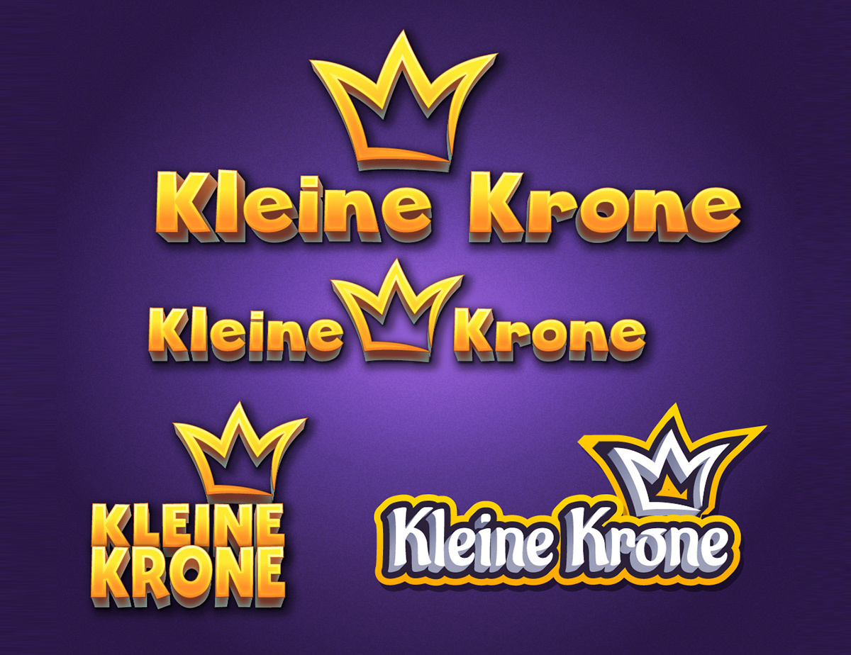
The mission was to work with SCHMIDT.GRUPPE’s in-house graphic designer to create a design that perfectly fits the casino gaming theme. At the time, the crown logo, which appeared on the SCHMIDT.GRUPPE’s 'Spielstation' casinos, was the only given graphic element. Until then, it wasn't clear what the planned online casino would even be called.
Young, dynamic, and catchy - that's how we imagined the result and with this impetus, our brand-building began. From the colour scheme and typography to avatars and pop-ups, we developed a complete visual identity that expresses what the social casino actually embodies. In close collaboration with the SCHMIDT.GRUPPE, we helped craft a product with a clear and notable external impact.
'Nomen est omen’ and how trial and error is the key to success
Before we could get started on the visual identity, we needed to find a name for the social casino. To do this, we worked intensively with the SCHMIDT.GRUPPE. Everyone was encouraged to contribute their own ideas, which were then voted on together. Since the crown was a key element of the Spielstation casino brand, it made perfect sense to include it in the name in some way. The initial brainstorming process resulted in an abundance of suggestions, such as "Kronenspiel" (Crown Game). In the end, we decided on "Kleine Krone" (Little Crown). While it had occurred to us that the term "little" can have a diminutive association, the benefits of the name outweighed these potential concerns. "Kleine Krone" just felt right. It's catchy, evocative, and amicable. It also helps identify the social casino as an online offshoot of the stationary gaming machines that the SCHMIDT.GRUPPE distributes.
Once we decided upon the name, our next step was to develop a design template. We sketched out multiple ideas in order to have a variety of approaches available. These sketches formed the basis of a protodesign that we wanted to programme. First, we had to find a colour scheme and typography to match the logo and name. By the end, we had a portfolio in front of us ranging from strong and minimalist, to playfully kitsch, all the way round to royally elegant designs. We worked on the assumption that the design language of a social casino could be more playful than that of a brick-and-mortar casino. This gave us more freedom and opportunity to be creative, but also made it harder to decide on a template. In the end, we chose a universally appealing design with gold lettering and a dark background that reflects the royal aspect of the online casino and appears neither too serious nor too playful.
The power of combined skills: Illustration meets UI/UX design
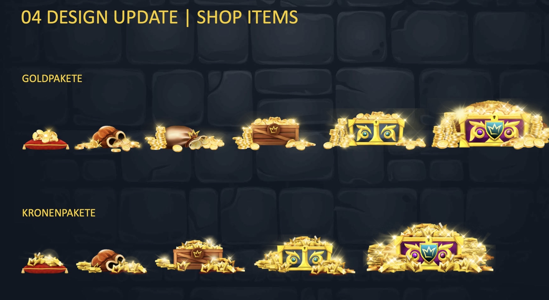
The royal theme of the design runs like a red thread through each element we developed for the online casino. This includes the crown and gold packages, which we drew as velvet bags or bulging treasure chests according to ascending value, as well as the casino's currency, which is aesthetically based on the Danish krone. With the colour palette, too, we primarily focused on typical regal colours, such as gold and crimson and, of course, purple, which in the Middle Ages was considered a ruler's colour and was reserved exclusively for kings and queens.
Throughout our collaboration, we worked to combine illustrative skills with UI/UX skills and were able to benefit from the strengths and resources of everyone involved. Together, we designed avatars ranging from knights to princesses, alongside thematically appropriate icons. We started with simple 2D graphics and developed solid 3D characters with a realistic look and weight. Each of us proposed our own design templates, from which we took the best elements and combined them into a unified whole. The work was small-scale and ranged from conceptualising pop-ups to developing the login area.
While our design contains historical/ancient elements, it comes across as universally regal. In the end, we moved away from the overt medieval Europe focus we had at the beginning of the development. The reason for this is that there are slots with different settings (Ancient Egypt, Samurai, etc.) in the social casino that do not fit with a purely medieval metaphor. Our design unites all themes and metagames without being vague. To further harmonise them, we have given all slot images a uniform frame.
In this way, we ensure a clear visual language while bringing together all the different worlds of the online casino.
The balancing act between web and mobile view
Kleine Krone can be played on a web browser as well as via an app on mobile devices. This improved accessibility presented us with the task of adapting and optimising our design for the mobile view. To ensure the best display on smartphones and tablets, and to make the best use of the space available, design elements such as frames or curtains had to give way. In this context, it was crucial that the royal metaphor remained recognisable and the 'red thread' running through the design was not lost. We were able to ensure this by inserting semantically relevant icons such as the currency.
We were faced with a similar challenge of retaining the holistic theme when users are in the middle of a slot game. Especially on mobile devices, as much as possible of the specific theme world should be displayed. However, users should not be under the impression that they are in a completely different game. We chose to create a header and a sidebar that carry meta-information as this was the best way to establish a connection to Kleine Krone without crowding out the display. Players can see how much there is to win at the moment, who is leading in a tournament, and so on. The responsive solution, in this case, was to make the information also fade in and out.
Powerful tools and perfect interfaces
Thanks to the seamless coordination and acceptance processes with the SCHMIDT.GRUPPE, we were able to achieve rapid results. This was not only because we quickly agreed on the content and concept, but also because we had the right interfaces for each area. For example, we were able to provide our web design to a web programmer and our app design to an app programmer.
For the development of the layout and for wire-framing, we used Sketch. With this, we coordinated all the non-pixel graphical elements and built our designs from them. For the transfer, we used the collaborative workspace Zeplin, which works as a plug-in in Sketch. We uploaded our wireframes directly from Sketch and made them available to the programmers via Zeplin. One of the advantages of using this tool is that it allows us to automatically add annotations to the files. For example, we could comment on pixel sizes, colours, and margins. The programmers could immediately see the CSS and knew how we wanted it built.
A crowning achievemen
Kleine Krone is a project that has demonstrated the enormous potential of synergies. Working closely with SCHMIDT.GRUPPE, it was possible to incorporate everyone's expertise into the design development, resulting in a solution that combined the best of all worlds. We experimented frequently, implemented our visions, had a meaningful say in aspects of the product's external appearance and characteristics, and ultimately built a brand together all while having a lot of fun! Kleine Krone is also a project that holds a lot of potential for change and motivates me as a designer to constantly improve and evolve. It's exciting, challenging, dynamic and progressive. This project challenges me to keep thinking in new ways and to take on different perspectives - and that's enriching in every way.